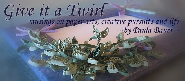
I suffered a small blog disaster a few days ago, hit the wrong button and erased my customized 3-panel template.
ouch!
So I tidied things up and revamped. Inspired by Ann's new blog, I wanted a cleaner look, too! Visitors should now be able to move around without bumping their shins, metaphorically speaking, on all those columns and widgets I had crammed in here.
Do you like it? Do you miss something I deleted? Let me know, and I'll try to add it back just for you! Will be tweaking things a bit in the day ahead.
The header is a variation of my best-selling design, Dragonfly & Vine. The 'side view' photo really captures the 3-D nature of paper filigree art.
It's a technique gleaned from Tracy Belair Gaito, who captures her work using distinctive, unusual camera angles. Her photos are some of the best I have seen with a very fresh, engaging perspective instead of the same old straight-on shot -- my default method.
So I've been trying to follow Tracy's lead and select different perspectives to accent unique details, as on this 50th anniversary mat gifted to my aunt and uncle several years ago.

So I've been trying to follow Tracy's lead and select different perspectives to accent unique details, as on this 50th anniversary mat gifted to my aunt and uncle several years ago.


Here's the straight-on view.
The drawback to angled views is you need a number of photos to show the entire piece, and even then it's often difficult to visualize the entire piece as a whole. So there is a place for both approaches.
Which do you find more appealing?
Visit Tracy's website to see more examples, particularly numbers 11, 17, 18 & 19 in her slide show. I would have shared those photos here, but I didn't want to wait for her permission to use them (and wouldn't violate her copyright by posting them without her okay). It's easier to just send you on over to visit her directly!
Got any great photo tips to share?
Would love to hear them!


